After we had designed the new Kornit website, Kornit requested we redesign and create a mini sub brand for their online magazine, re-christening it "Pixel to Parcel".
The former blog was very Kornit-oriented and featured mainly articles and posts about new features by the company. Having grown vastly, Kornit wanted to position itself as an authority in the field and contribute to generating non commercial content as well.
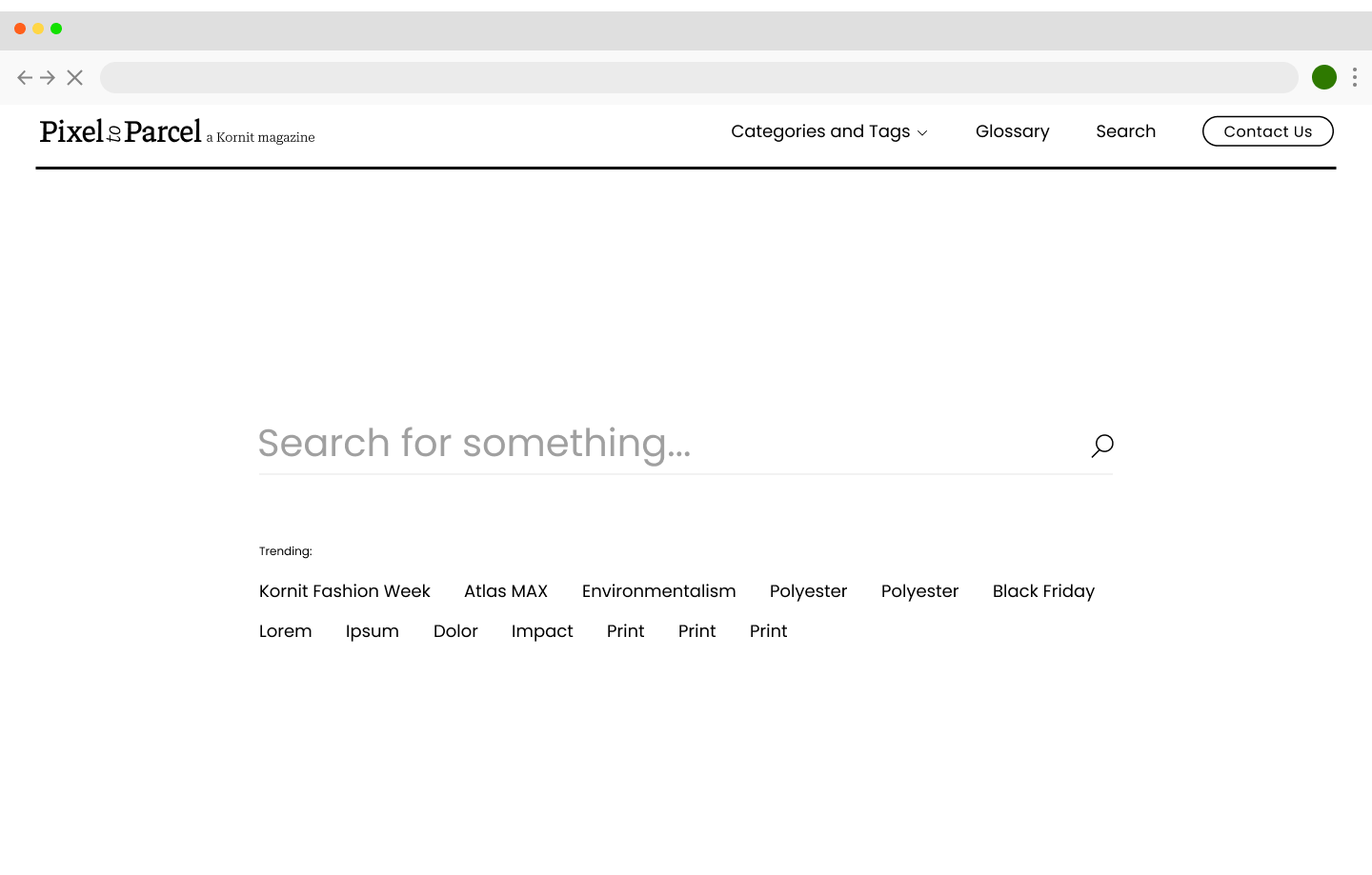
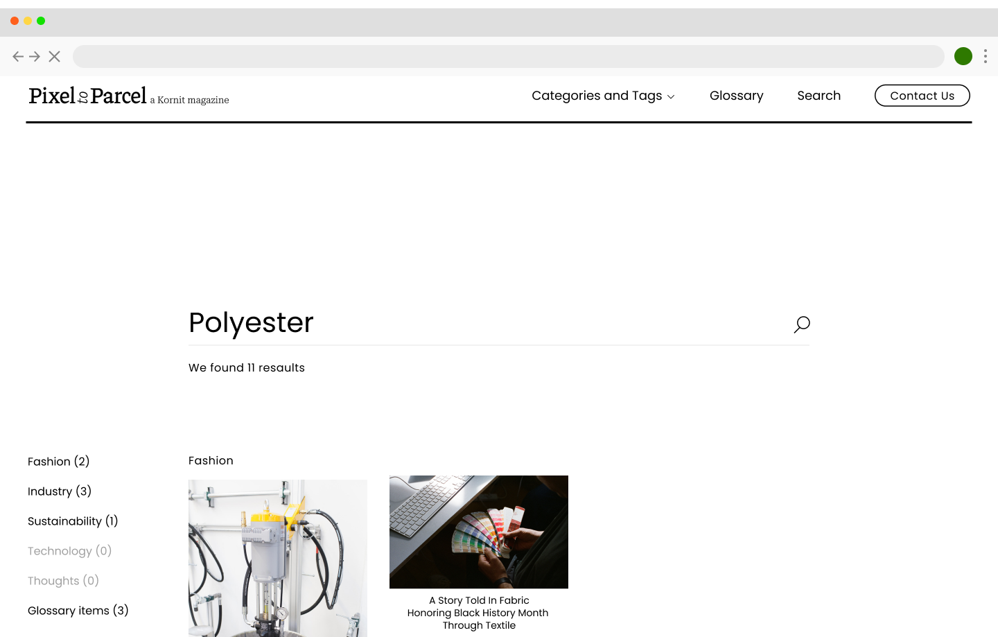
And so, the project's focus was to create an educational platform that would grow to host large quantities of content consumed by people from the textile and fashion industries.
The former blog was very Kornit-oriented and featured mainly articles and posts about new features by the company. Having grown vastly, Kornit wanted to position itself as an authority in the field and contribute to generating non commercial content as well.
And so, the project's focus was to create an educational platform that would grow to host large quantities of content consumed by people from the textile and fashion industries.
Visit pixeltoparcel.com to see the full site
We conducted a large-scale research to identify what would make Kornit's blog an influential and authoritative magazine
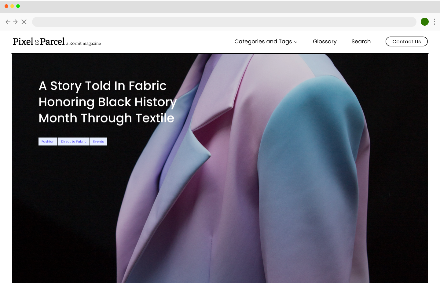

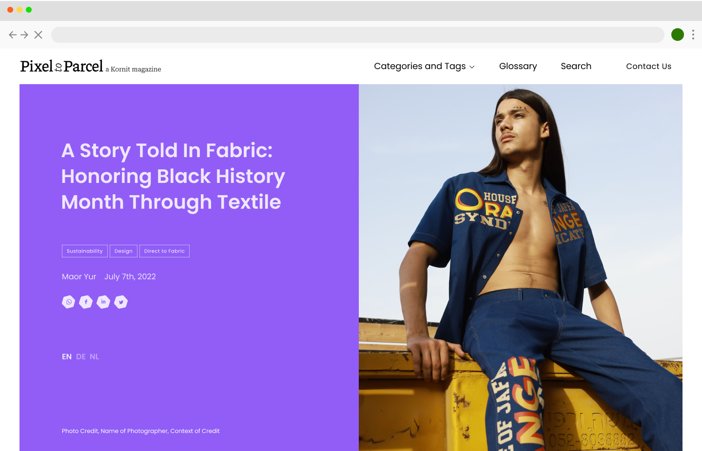
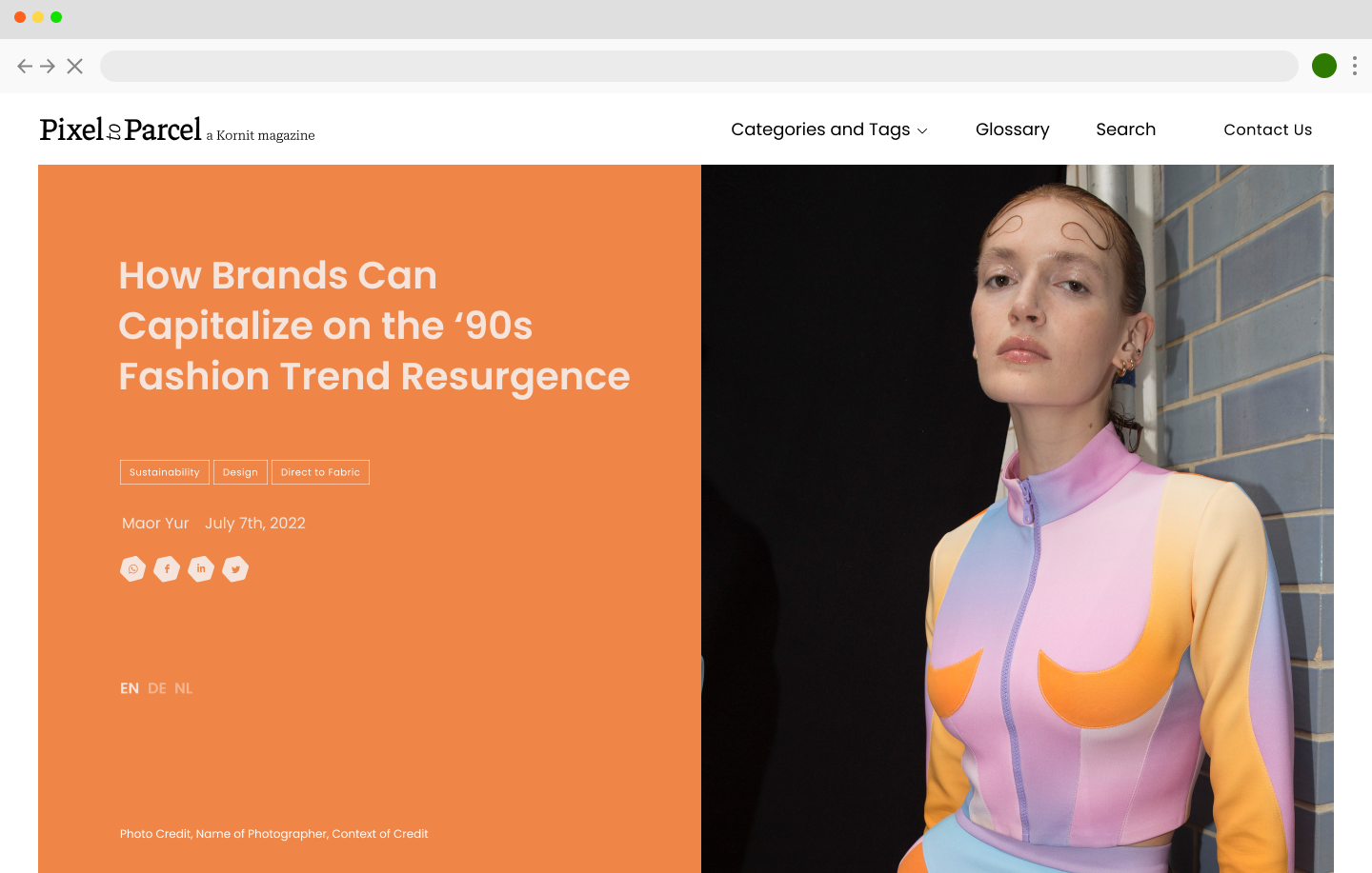
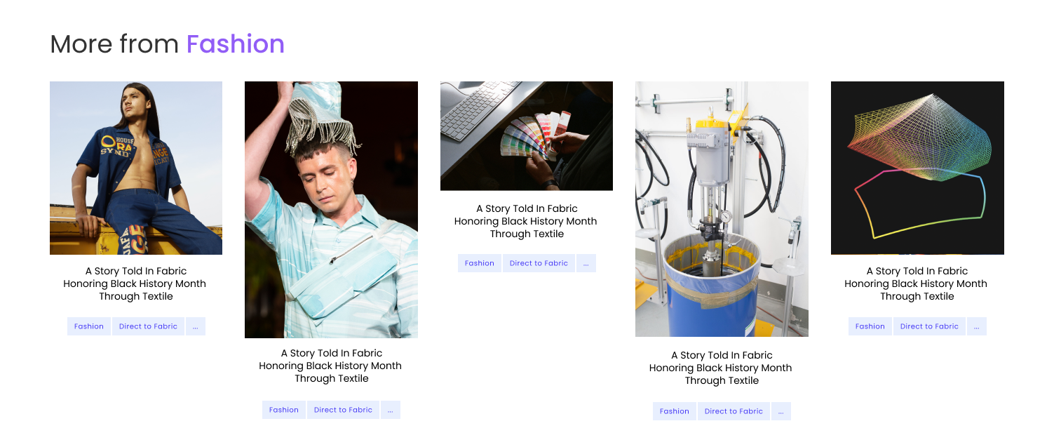
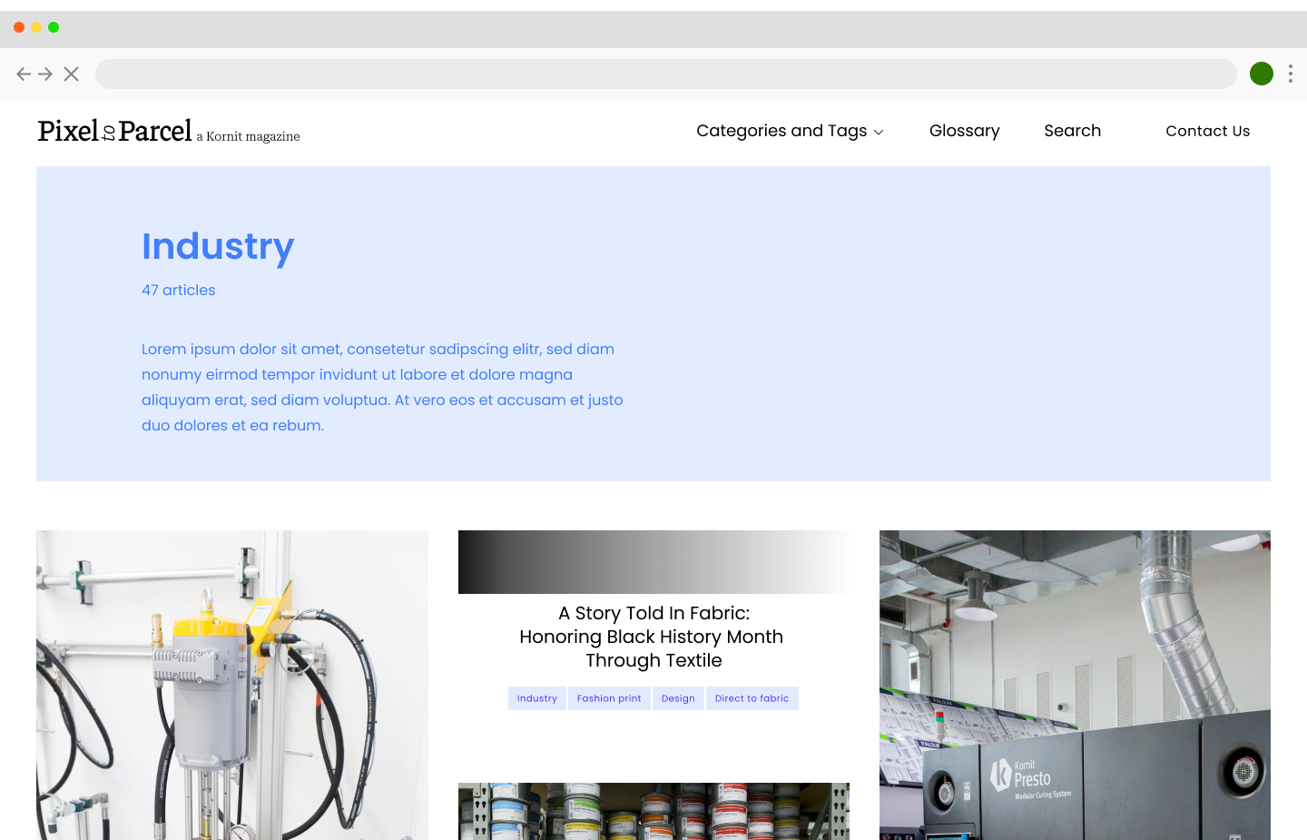
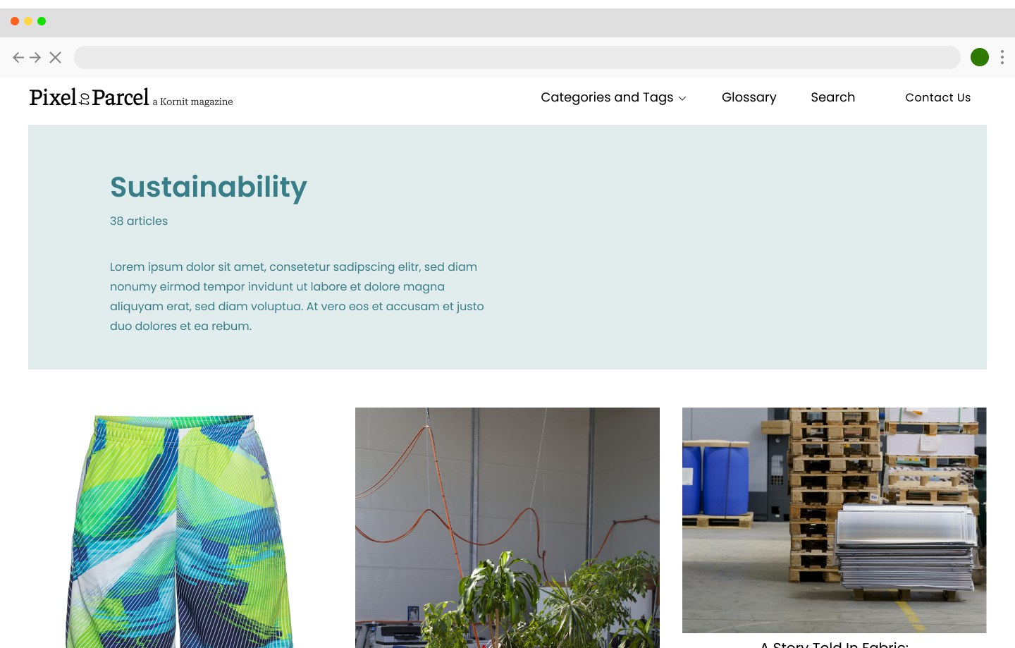
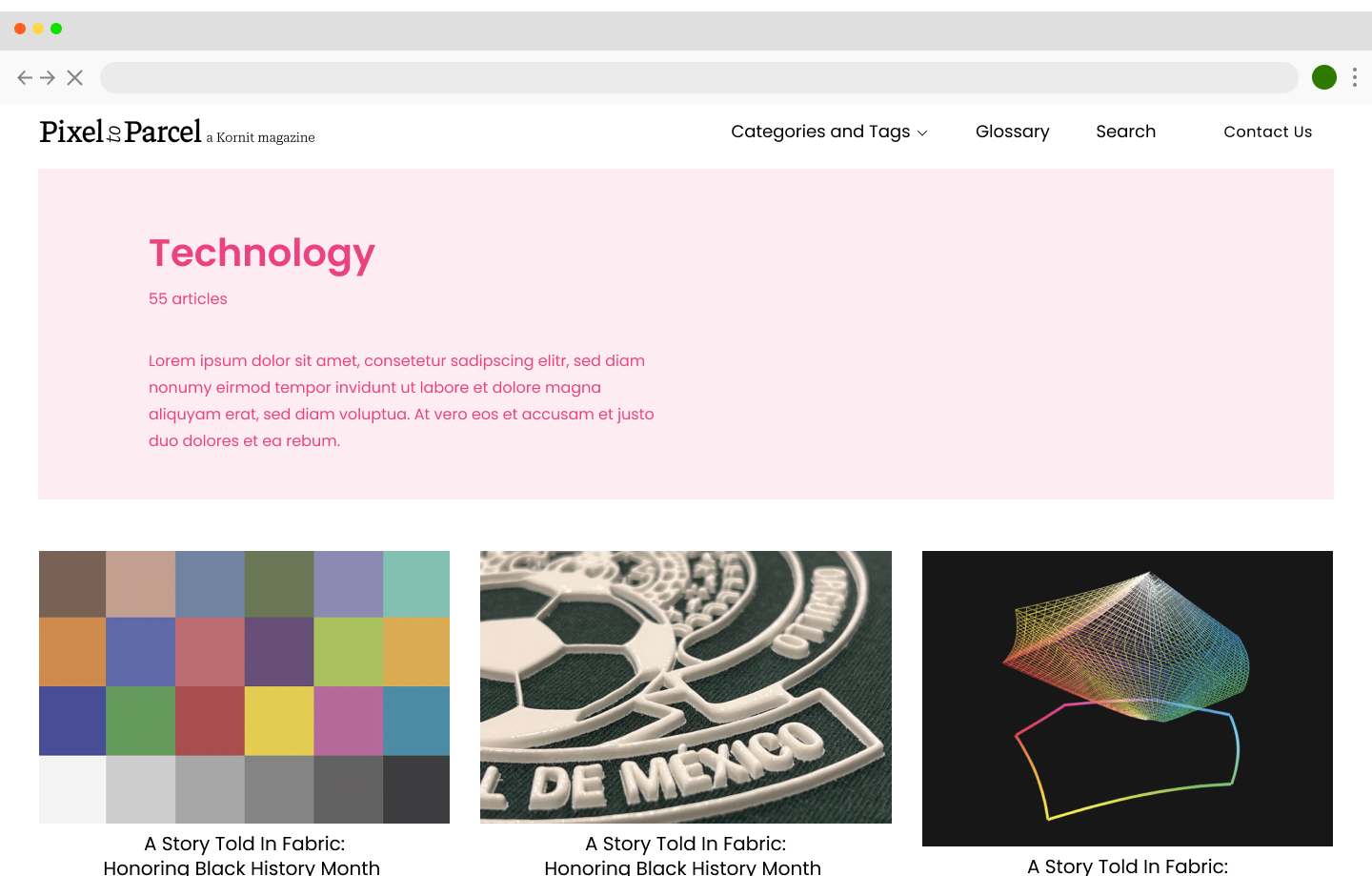
We used the bold colors from Kornit's brand to color code the different content categories and added new tints to the brand. We made the vivid blue and its accompanying tint the magazine's "system color" to differentiate static content from varying categories.
At a later stage of the process, we were also requested to design the logo and favicon for the blog.

Designed at Designit Tel-Aviv with Carmelle Rubinstein, 2022